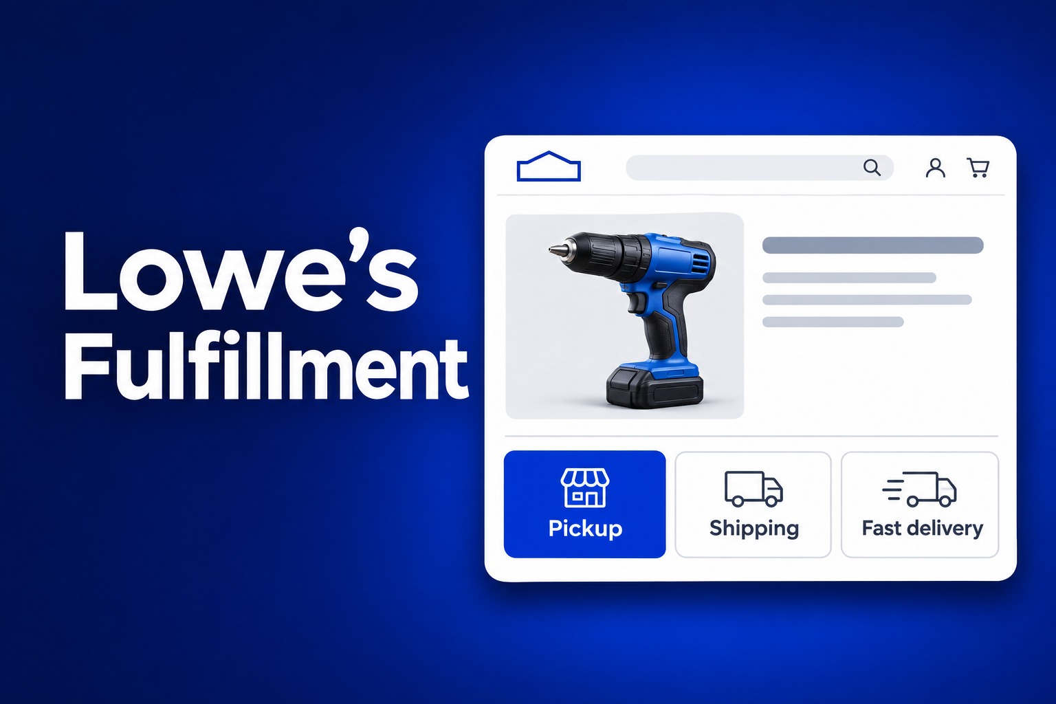
Product detail to cart
Baseline6.5%
Modeled7.7%
+1.2 percentage points modeled
Lowe’s · Retail e-commerce
Fulfillment information across product listings, product pages, and cart helps shoppers compare when and how they can get an item.

Role and scope
I owned fulfillment design and partnered with designers and product managers across pre-purchase, purchase, and post-purchase to implement fulfillment features in their parts of the experience.
The shopping journey
To reduce cognitive load, I mapped what customers needed to know at each stage. That map guided what information to show and when to give customers a way to act on it.
Pain point It’s easy to miss whether the item is available nearby or can arrive in time.
Design response Put pickup availability and delivery timing on the product card.
Pain point Pickup details and fast delivery pricing appear in separate places.
Design response Show pickup, shipping, and fast delivery side by side with timing and pricing or eligibility.
Pain point A delivery fee or a slower option can surprise shoppers late in the journey.
Design response Keep the selected method visible and show alternatives before checkout.
Design decision
The product detail page is where the shopper can weigh speed against cost before adding the item to their cart.
Pickup appears as a line of text, while fast delivery pricing appears in the loyalty banner.

Pickup, shipping, and fast delivery have their own cards with timing and cost or eligibility details.
Conversion funnel
Follow the same item from browsing to checkout. Each screen answers the question shoppers face before moving forward.
Show pickup availability and delivery dates on the item card.

Compare pickup, shipping, and fast delivery in one place.
Confirm the selected method or switch before checkout.

Stage measures show how to evaluate each step of the journey.
Impact model
The model compares baseline rates with a scenario in which shoppers see clearer fulfillment timing and costs. The figures are projections. Post-launch lift requires separate measurement.
+1.2 percentage points modeled
+8 percentage points modeled
+6 percentage points modeled
Source: Lowe’s fulfillment analysis, Business Impact (Modeled).